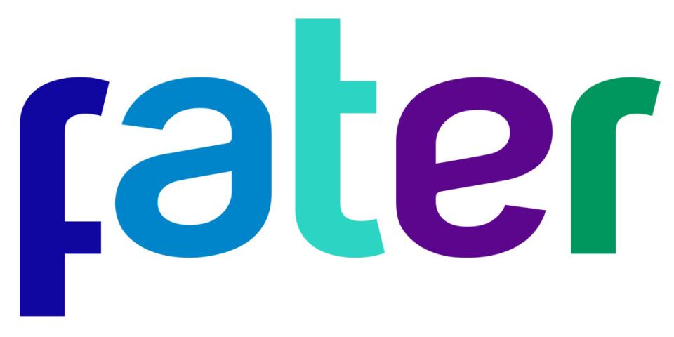
FATER rebranding is the tangible sign of a renewed promise made to markets and stakeholders. The new image designed to support the company’s future in the coming decades. The vision of a company that is increasingly focused on dialogue and committed to innovation and at the same time works through its brands as an active advocate for society and the environment.
The new Fater logo – designed by INAREA - is composed of unique fonts, designed to tell the core values of the company: modern spirit, openness, inclusion and interconnection.
The letters were carefully designed to convey equality and empathy through the sinuosity of the forms and the realization of elements equal and interchangeable between them: the «t» is nothing more than a «f» rotated and mirrored, and the «r» is generated by the same letters. The same is for the «a» and the «e». The colours, which aim to underline the openness to diversity, are inspired by the distinctive colours of Fater brands.
The change of a logo is always a milestone in the history of a company.
For Fater, it means looking at the future, emphasizing the commitment to put people at the center of its business, in an increasingly open relationship with all stakeholders.